Next Previous Up Contents
Next: Lines Style Editor
Up: Old-Style Plot Windows
Previous: Plot Style Editor
This section describes an old-style plotting window.
The standard plotting windows are described in Appendix A.4,
though note that at time of writing (v4.1) no equivalent new-style
plotting window is available for plotting stacked lines.
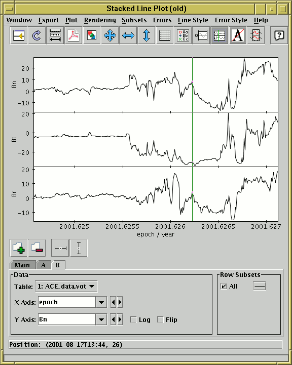
Stacked Lines Window
The stacked line plot window allows you to plot one or more ordinate (Y)
quantities against a monotonic abscissa (X) quantity.
For clarity, the different plots are displayed on vertically
displaced graphs which share the same X axis.
You can display this window using the Lines ( )
item in the Control Window's
Graphics menu.
)
item in the Control Window's
Graphics menu.
The display initially holds a single X-Y graph, usually with lines
connecting adjacent points. The points will be reordered before drawing
if necessary so that the line is displayed as a function of X, rather
than of an invisible third independent variable
(in the Scatter Plot this isn't done which
can lead to lines being scribbled all over the plot).
If one of the columns in the table appears to represent a time value,
this will be selected as the default X axis. Otherwise, the
'magic' index variable will be used, which represents
the row number. Of course, these can be changed from their default
values using the selectors in the usual way.
To add a new graph with a different Y axis, use the
Add Dataset ( ) button in the
Dataset Toolbar at the bottom of the window.
This has a slightly different effect from what it does in the other
plot windows, in that it inserts a new plotting region with its own
Y axis at the top of the plot on which the specified data is drawn,
rather than only causing a new set of points to be plotted on the
existing plot region.
Thus all the datasets appear in their own graphs with their own Y axes
(though if you have multiple row subsets plotted for the same
dataset they will appear on the same part of the plot as usual).
To remove one of the graphs, select its tab and use the
Remove Dataset (
) button in the
Dataset Toolbar at the bottom of the window.
This has a slightly different effect from what it does in the other
plot windows, in that it inserts a new plotting region with its own
Y axis at the top of the plot on which the specified data is drawn,
rather than only causing a new set of points to be plotted on the
existing plot region.
Thus all the datasets appear in their own graphs with their own Y axes
(though if you have multiple row subsets plotted for the same
dataset they will appear on the same part of the plot as usual).
To remove one of the graphs, select its tab and use the
Remove Dataset ( ) button as usual.
Zooming can only be done on one axis at a time
rather than dragging out an X-Y region on the plot surface, since
there isn't a single Y axis to zoom on.
To zoom the X axis in/out, position the mouse just below the X axis
at the bottom of the plot and drag right/left.
To zoom one of the Y axes in or out, position the mouse just to the
left of the Y axis you're interested in and drag down/up.
To set the ranges manually, use the Configure Axes and Title
( ) button as usual, but note that there is one
label/range setting box for each of the Y axes.
These things work largely as described in Appendix A.5.1.2,
as long as you bear in mind that the range of each of the Y axes
is treated independently of the others.
) button as usual, but note that there is one
label/range setting box for each of the Y axes.
These things work largely as described in Appendix A.5.1.2,
as long as you bear in mind that the range of each of the Y axes
is treated independently of the others.
Clicking on any of the points will activate it -
see Section 8.
The following buttons are available on the toolbar:
-
 Split Window
- Allows the dataset selector to be resized by dragging a separator
between it and the plot area. Good for small screens.
-

- Redraws the current plot. It is usually not necessary to
use this button, since if you change any of the plot characteristics
with the controls in this window the plot will be redrawn
automatically. However if you have changed the data, e.g. by
editing cells in the Data Window,
the plot is not automatically redrawn (since this is potentially an
expensive operation and you may not require it).
Clicking this button redraws the plot taking account of any changes
to the table data.
-
Configure Axes and Title
- Pops up a dialogue to allow manual configuration of the range
and label for the X axis and each of the Y axes, as well as a plot title -
see Appendix A.5.1.2.
-
 Export as PDF
- Pops up a dialogue which will write the current plot as a PDF file.
-
 Export as GIF
- Pops up a dialogue which will output the current plot to a GIF file.
The output file is just the same as the plotted image that you see.
Resize the plotting window before the export to control the size
of the output GIF.
-
 Rescale
- Rescales all the plots so that all points in the plotted datasets
can be seen. The X axis and all the Y axes are rescaled to fit the data.
-
 Rescale X Axis
- Rescales the X axis only. The X axis is rescaled to cover the
lowest and highest values on any of the plotted datasets, but the
Y ranges are left as they are.
-
 Rescale Y Axes
- Rescales the Y axes only. Each of the plotted Y axes are
independently rescaled so that they cover the lowest and highest
values within the currently visible X range.
-
 Full Grid
- Toggles whether X and Y grid lines are drawn over the plots or not.
If this is selected, the single y=0 grid line (see next item)
will automatically be deselected.
-
 Show Legend
- Toggles whether a legend showing how each data set is represented
is visible to the right of the plot. Initially the legend is shown
only if more than one data set is being shown at once.
-
 y=0 Grid Lines
- Toggles whether a single horizontal line at y=0 is drawn.
If this is selected, the full grid (see previous item)
will automatically be deselected.
-
 Show Vertical Crosshair
- Toggles whether a vertical line follows the mouse when it is
positioned over the plot. This can be useful to compare features
in different graphs at the same X coordinate position.
-
 Antialias
- Toggles whether lines are drawn with antialiasing.
Antialiasing means smoothing lines so that they appear less pixelised,
and generally improves the aesthetic appearance of the plot,
but in some circumstances it might look better not antialiased.
The state of this button does not affect images exported to postscript.
-
 Subset From X Range
- Defines a new Row Subset in each of the plotted
tables consisting of only the points in the currently visible range
on the horizontal axis. Points will be included even if they are
outside the current ranges of the Y axes.
The Dataset Toolbar contains the following options:
-
/ Add/Remove dataset
- Adds/removes a dataset for plotting, which both adds/removes a
tab from the dataset selector and adds/removes a plot in the currently
visible stack in the plotting area. See above for more explanation.
-
 /
/  Toggle X/Y error bars
- Switches between drawing symmetric error bars and no error bars
in the X and Y directions respectively.
Other options are available in the Errors menu.
See Appendix A.5.1.3.
You can determine how the data are plotted using lines and/or markers
as described in the following subsection.
Next Previous Up Contents
Next: Lines Style Editor
Up: Old-Style Plot Windows
Previous: Plot Style Editor
TOPCAT - Tool for OPerations on Catalogues And Tables
Starlink User Note253
TOPCAT web page:
http://www.starlink.ac.uk/topcat/
Author email:
m.b.taylor@bristol.ac.uk
Mailing list:
topcat-user@jiscmail.ac.uk