Next Previous Up Contents
Next: Aux Mode
Up: Shading Modes
Previous: Auto Mode
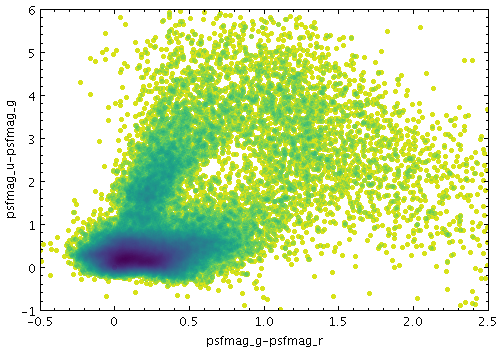
Example Density shading mode plot
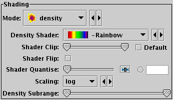
Density mode selection
The Density shading mode ( )
uses a configurable colour map
to indicate how many points are plotted over each other.
Specifically, it colours each pixel according to how many times that
pixel has has been covered by one of the shapes plotted by the layer
in question.
To put it another way, it generates a false-colour density map
with pixel granularity using a smoothing kernel of the form of
the shapes plotted by the layer.
The upshot is that you can see the plot density of points or other
shapes plotted.
)
uses a configurable colour map
to indicate how many points are plotted over each other.
Specifically, it colours each pixel according to how many times that
pixel has has been covered by one of the shapes plotted by the layer
in question.
To put it another way, it generates a false-colour density map
with pixel granularity using a smoothing kernel of the form of
the shapes plotted by the layer.
The upshot is that you can see the plot density of points or other
shapes plotted.
This is like Auto mode, but with more
user-configurable options. The options are:
-
Density Shader
- The colour map for displaying density values.
There are two types, relative and absolute.
Relative maps have names marked by a star ("*"), and alter the
basic dataset colour, for instance by darkening or lightening it,
while absolute maps (the rest) ignore the basic dataset colour altogether.
For a single-dataset plot, the absolute maps are best, but for
multiple subsets it may be less confusing to use a relative one.
Colour maps are listed in Appendix A.4.7.
-
Shader Clip
- Select a sub-range of the full colour map above.
If the Default checkbox is checked, then all or most
of the colour ramp from the Shader control is used.
If you want to configure the range of colours from the map yourself,
uncheck the Default checkbox, and slide the handles in from the end
of the slider to choose exactly the range you want.
The default range is clipped at one end for colour maps that fade
to white, so that all the plotted colours will be distinguishable
against a white background.
If you don't want that, you can
uncheck Default and leave the handles at the extreme ends of the slider.
-
Shader Flip
- Whether the density scale should map forwards or backwards
into the colour map.
-
Shader Quantise
- Allows the colour map to be quantised.
By default, the colour map is effectively continuous.
If you slide the slider to the right,
or enter a value in the text field,
the map will be split into
a decreasing number of discrete colours. This can be used to generate
a contour-like effect, and may make it easier to trace the boundaries
of regions of interest by eye.
-
Scaling
- Determines the function used to map the range of density values
onto the colour map.
Options are linear,
logarithmic,
histogram,
logarithmic histogram,
asinh,
square,
square root,
arc cosine and
cosine.
-
Density Subrange
- Adjusts the density range over which the colour
map is applied. By default the colour map is scaled using limits
found from the data density in the plot (the most dense few pixels are
ignored), but you can restrict the range using this slider.
Although these options give you quite some control over how
densities are mapped to colours, this mode does not display
the colour mapping in a way that shows you quantitatively
which colours correspond to which numeric density values.
If you want that kind of visual feedback,
you should use the Weighted shading mode,
which can be configured to display point densities
(as well as other quantities),
and also causes a colour ramp to be displayed under control
of the Aux Axis control.
Exporting:
When exported to vector formats, the output is automatically forced to a
bitmap for Density-mode layers.
In the case of PostScript, this completely obscures any previous layers.
Next Previous Up Contents
Next: Aux Mode
Up: Shading Modes
Previous: Auto Mode
TOPCAT - Tool for OPerations on Catalogues And Tables
Starlink User Note253
TOPCAT web page:
http://www.starlink.ac.uk/topcat/
Author email:
m.b.taylor@bristol.ac.uk
Mailing list:
topcat-user@jiscmail.ac.uk