Default dataset selector from 2d scatter plot window
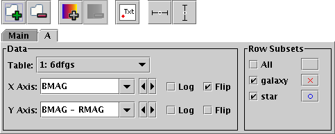
All the old-style graphics windows provide one or more axes on which to plot - the histogram has 1, the 2d scatter and density plots have 2, the 3d scatter plot has 3 and the spherical plot has 2 or 3. In each case you select one or more dataset to plot on these axes, and select what plotting style to use for each set. A dataset is typically a number of columns from a table (the number matching the dimensionality of the plot) and a selection of row subsets associated with that table. You select this and the plotting style(s) using the panel at the bottom of each plot window. Here is dataset selector for the 2d scatter plot:
Default dataset selector from 2d scatter plot window
The different parts of this control work as follows:
The Axis selectors (here X Axis and Y Axis) give the quantities to be plotted. If you click the little down arrow at the right of each selector you get a list of all the numeric columns in the chosen table, from which you can select one. If you click the little left and right arrows to the right of the selector it will cycle through all the columns in the table. However, if you prefer you can type in an expression to use here. This may be more convenient if there's a very long list of columns (another way to deal with this is to hide most of the columns using the Column Window). However, what you type in doesn't have to be a column name, it can be an algebraic expression based on columns in the table, or even a constant. In the example, the X axis is a straight column name, and the Y axis is an expression. The expression language syntax is explained in Section 7.
The Log checkbox for each axis is used to select whether the scale should be logarithmic or linear.
The Flip checkbox for each axis is used to select whether the axis values increase in the conventional direction (left to right, bottom to top) or its opposite.
Some of the buttons in the toolbar shown will modify what is visible in this panel, for instance inserting new selectors to allow selection of error values. All the selectors work in the same way however.
The buttons to the right of each subset name show the symbol that is used in the plot to display the data from that subset, in this case a red cross and a blue circle. These are selected automatically when the subset is first selected for viewing (the initial default style set depends mainly on how many rows there are in the selected table - many rows gives small dots, few gives big ones). However, you have a lot of freedom to configure how they appear. If you click the button with the symbol on it a dialogue will pop up which allows you to select colour, shape, transparency and so on, as well as error bar style if appropriate and things like whether fitted lines will be plotted for that subset. The options available differ according to the kind of plot, and are described along with the different graphics windows in the following subsections. The style window stays visible until you dismiss it, but if you click on another of the buttons in the Row Subsets panel its contents will change to allow you to select values for the corresponding subset. Most graphics windows have a Marker Style menu. This allows you to change all the styles in the plot at once to be members of a uniform set, for instance different coloured pixels, or black open shapes. If you select one of these it will overwrite the existing style selections, but they can be edited individually afterwards.
The Add Dataset (![]() )
and Remove Dataset (
)
and Remove Dataset (![]() )
buttons in the toolbar add a new tab or remove the selected one
respectively.
Initially only the Main tab is present, and this one cannot be removed.
)
buttons in the toolbar add a new tab or remove the selected one
respectively.
Initially only the Main tab is present, and this one cannot be removed.
Sometimes (high-dimensional plots, auxiliary axes, error bars) a lot of information needs to be entered into the data panel, and the bottom part of the window can get quite large. Normally, the plot in the upper part of the window shrinks to accommodate it. You can of course resize the window to gain more space, but if your screen is small you may still end up with an uncomfortably small plot. If this happens, you can use the following button from the main toolbar: